How to Choose Art That Sets the Mood in Your Home
Have you ever walked into a room and were overwhelmed with a feeling, but you couldn't put your finger on why? Maybe you felt calm, or maybe you felt energized or even anxious.
That's the power of color. Artists have known for centuries that certain colors evoke certain feelings in us: red and orange make us feel energized, white and blue calm us, while black and dark gray can make us feel somber or a sense of foreboding.
That's the psychology of color, and it's a big deal in art.
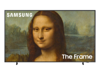
When you're decorating your home, especially with a new Samsung Frame TV that shows off classic and modern artwork, understanding the basics of color theory can help you create the perfect mood with the right piece of art.
You're not just picking pretty pictures, you're setting the stage for how you want to feel in each room. Do you want your living room to be a place to relax after a long day? Or do you want your dining room to be lively and full of energy when gathering with family and friends? The art you choose and the colors within it can make a real difference.
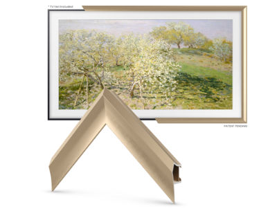
Here are a few paintings with different colors that you can display on your Frame TV and surround it with a Deco Frame to complete the image.
1. "Saint Tropez, the Storm" by Paul Signac (1895)
Part of the Neo-Impressionism art movement, "Saint Tropez, the Storm" falls under the marina genre. It shows off his mastery of the pointillist technique, using small dots of unmixed color to set the scene. The scene contrasts a calm sea with a sailboat below and a turbulent sky above. Yellow buildings on the right contrast the rich blue and green of the sea and the blue and white of the sky. He even dappled in some yellow to show the reflection of the buildings.
Signac was able to use light and color to show the sense of the impending tempest while the peaceful calm of the sea and the sailboat racing across the bay, plus several sailboats moored in the background.
His inspiration came from his love of the town of Saint-Tropez, where he had moved in 1892. He enjoyed sailing and often painted the sea during his artwork. He was also influenced by the Neo-Impressionist movement, which used small dots of color to create vibrant images similar to artists like Georges Seurat, Dutch painter Jan Toorop, and Camille Pissarro, a Danish-French painter. It was Signac's interactions with other Neo-Impressionists like Henri-Edmond Cross that inspired Signac to adopt the pointillist technique.

2. "The Dessert: Harmony In Red" by Henri Matisse (1908)
The vibrant red in Henri Matisse's The Dessert: Harmony in Red leaps out from your wall and demands that you look at it, consider it, study it. The boldness of the red overpowers the other colors while giving them a chance to assert themselves as well: the green and blue of the scene outside the window, the blue and yellow of the wallpaper, and the blue and white of the woman arranging the fruit display.
The red evokes feelings of warmth, passion, and excitement, which can create a lively atmosphere for your social gatherings. It can stimulate conversation and creativity, making it the ideal piece for spaces where creative people come together.
When you balance it with neutral tones or natural elements, like white or gray walls and wood furniture, the red adds depth and visual interest to the room. The emotional impact can be invigorating and playful or cozy and intimate, depending on how you integrate it into your space.
The piece, often called "The Red Room," is an example of Matisse's leadership in the Fauvist movement, where artists used wild and bold colors. To Fauvists, colors were used to show feelings and emotions rather than making things look real; they wanted to prioritize color over realism.

3. "Der Blaue Reiter (The Blue Rider)" by Wassily Kandinsky (1903)
Despite the name, this painting is predominantly green with a blue sky, brown trees, and a lone rider cloaked in blue, speeding across a vast green meadow. The abstract nature of the painting has led many art scholars to see their own images, such as seeing a child being sheltered by the blue rider, wrapped in his cloak.
Kandinsky was one of the first artists to paint in the abstract style, and "The Blue Rider" was the piece that changed the way he — and we — think about art forever. He used thick brushstrokes to make the scene look a bit blurry and added the blue rider to contrast with the green. Even though the painting is mostly green, he names it after the man on the horse.
In fact, the painting becomes so important, its name is given to an entire group of artists called The Blue Rider group, which Kandinsky started with his friend, Franz March, in 1911 .
Kandinsky's goal was not to try to make everything look real; he wanted the colors and shapes to make people feel something or create their own story, such as the scholars seeing the child being carried by the eponymous blue rider.
But is it a child? Is it his lunch? Or is it just the shadow of his cloak flapping in the wind? The feelings of our stories makes the painting even more interesting and help us feel the rider's urgency as he races through the meadow, looking for a safe place to eat his ham on rye.

4. "Wheat Field with Crows" by Vincent Van Gogh (1890)
"Wheat Field with Crows" is one of Van Gogh's last paintings and is considered one of his most emotionally charged and evocative works — except maybe for the one he painted after he cut off his ear. The work uses his signature vivid blue and bright yellow colors, but the reflection of his state of mind gives art scholars a lot to discuss.
The painting shows a vast wheat field under a stormy sky as crows fly ominously overhead. The tension between the golden wheat and the dark sky mirrors his emotional conflict, while the paths lead to seemingly nowhere, stopping in the middle of the field. The symbolism abounds in Wheat Field With Crows: the wheat shows life and growth, the crows and the sky represent darkness or impending crisis, and the paths show the lack of direction in Van Gogh's life.
Either that, or he just really liked blue and gold.
What makes this painting so special is its ability to convey raw emotions with just a landscape. His thick paints and heavy brushstrokes turn this simple rural scene into something deeply personal and filled with symbolism, mirroring his inner turmoil. It still serves as an enduring testament to his genius, even as his life was drawing to a close amidst his struggles with mental illness.

5. "Vision After the Sermon" by Paul Gauguin (1888)
Considered one of Gauguin's most famous paintings, it shows Breton women dressed in their regional costumes, have just listened to a sermon on the story of Jacob, who spent a whole night wrestling with a mysterious angel. In a letter he wrote to his friend Van Gogh, "For me, the landscape and the fight only exist in the imagination of the people praying after the sermon."
The most notable colors are the bright, almost unreal red ground that Jacob and the angel wrestle on; the 12 Breton women (and a single priest), in their traditional bonnets, wear deep purple and violet dresses, which contrast with the other-worldly red. All the women have their heads bowed in prayer, except for one who watches the battle with great interest.
Symbolism and Biblical Easter eggs abound in this painting ! The apple tree (tree of knowledge) that thrusts across the canvas, like one of Bob Ross' end-of-show trees; the 12 women representing the 12 tribes of Israel (and thus, Jacob's descendants); and even the cow to the left represents man's salvation through toil and work.
Gauguin was a post-Impressionist who used color to express his emotions and spiritual ideas. He spent a lot of time in Brittany (where "Vision After the Sermon" was painted) and in Tahiti, where he was inspired by the local cultures and beliefs. It has a strong use of reds, purples, and violets to create a sense of spiritual drama and mystery. Just like the Matisse painting above, the red background can add a note of drama to any room.

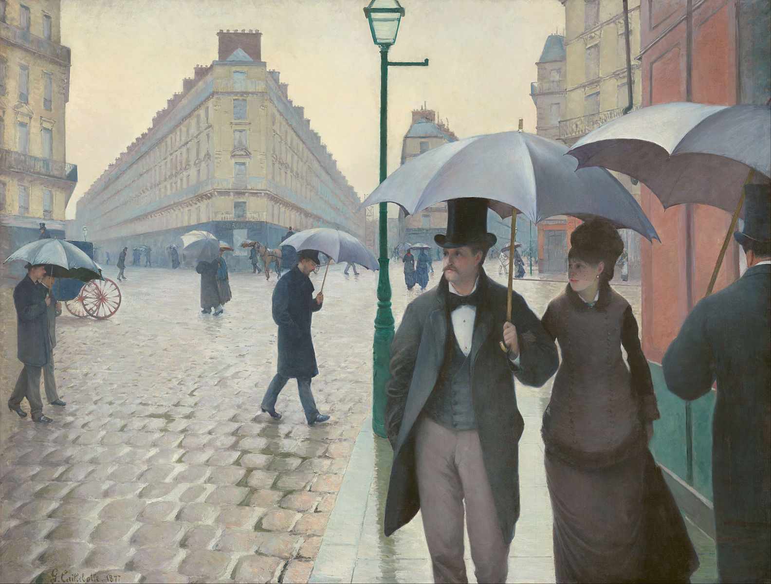
6. "Rainy Day, Paris Street" by Gustave Caillebotte (1877)
Honestly, the main colors of "Rainy Day, Paris Street" are so bland and unassuming, I always think of the main colors being red and green. That's because the Paris sky is so cloudy and gray during the rain that the building in the foreground — with its brick-red wall and green wainscoting — is the most vibrant.
Painter Gustave Caillebotte blends realism with Impressionist elements to capture a rainy day at the Place de Dublin, which was an urban renewal project that modernized the city. The couple in the foreground are elegantly dressed in the latest fashion, drawing our attention before it flits over to the aforementioned red and green building. The cobblestones reflect the passers-by in the background in the rain, making us feel like we're walking down the street and will have to step off the sidewalk to avoid the featured couple.
Unlike many Impressionists and their loose brushstrokes and vibrant colors, Caillebotte used thin strokes and a muted palette to achieve a more realistic effect. Even as the foreground and middle ground look like a painting, the background has the same attention to detail and haziness of an old photograph. In fact, the attention to detail combined with the slight haziness sometimes makes me think it is an old photograph.
Caillebotte uses his palette to capture the dampened feeling of a rainy day in the city. He wields grays, blues, and browns to evoke a feeling of melancholy: that gray feeling on a gray day. The background people hunched up against the falling rain, seeking shelter under their umbrellas as they hurry home to a warm fire and hearty dinner. Caillebotte used perspective to give his paintings depth and make them look real. Its soft colors can create a feeling of that pleasant melancholy you feel on a misty November morning.

Imagine stepping into your living room and being greeted by the vibrant energy of a Matisse or the calming effect of a Paul Signac. The art you choose for your Frame TV can transform your home into a space that reflects more than just your taste: it reflects how you want to feel.
Just like the artists we've showcased here today, your home is a canvas, and your chosen art is your palette. By understanding the psychology of color, you can create an environment that reflects your mood and mental state. A splash of purple from a Gauguin could inspire a sense of spirituality, while the muted grays of the Caillebotte can create a reflective atmosphere.
While we don't believe in choosing art that "matches" your furniture, we do believe in creating a space that resonates with you on a deeper level. The color matters almost as much as the subject of the paintings you show. Each color, brushstroke, light, and shadow contributes to the overall feeling of your home, turning it into a sanctuary of your own design.
Explore, experiment, and choose the colors that represent what you want to see and feel that day.